
After trying out RevenueCat and finding out (publicly) that it didn’t meet my (admittedly very high) expectations for ease of use, I decided to tackle the problem myself and started working on the open-source library FreemiumKit. To me, “ease of use” for a framework that helps with In-App Purchases means 3 things:
A clear step-by-step guide on how to get started – including App Store Connect.
A simple but flexible permissions system based on the current user’s purchases.
A unified paywall design framework for reusable shared paywall UI code.
The first two, I plan to cover in the libraries’ README. This article focuses on the third aspect: How does FreemiumKit help you build a successful paywall quickly? And how can it help you with A/B testing?

FreemiumKit makes StoreKit 2 integration easy as pie. With built-in paywalls & permissions.
Basic Idea
One of the things I had expected from RevenueCat, simply because people were soo positive about it all the time, was that they provide ready-to-use UI components in their Swift SDK. But they don’t. (UPDATE: After my complaints, they started working on it!) All they do is integrate with another service that specializes in providing paywalls and helping users optimize their paywalls by trying out different designs: Superwall. By the way, if you don’t know what A/B testing is – trying out different designs and assessing the data to see what works best is pretty much the definition. A paywall is probably the most important screen to A/B test. So while I really like the idea of the service, its pricing doesn’t scale down very well: They require $0.20 for each purchase, which for a monthly subscription of $1 is 20% of your income – that’s even higher than the 15% Apple keeps for Small Businesses!
Also, I’m personally not a fan of using many 3rd party services, I like to keep my app’s privacy policies short and simple, which becomes harder to do with every new service added. So I rather prefer to select a more “general purpose” analytics service that comes with A/B testing support (among other things) and choose that wisely than integrating with many microservices. But of course, that’s just my personal taste and you might choose differently. There’s certainly one thing I really love about Superwall though: They run the PaywallScreens website, where you can find a nice overview of thousands of real-world paywalls sorted by the estimated income that each app generates, currently led by YouTube, TikTok, and Disney+.
In the first release of FreemiumKit, I wanted to ship everything needed to build a successful paywall UI quickly, so I scrolled through all 312 paywall screens of apps with a higher estimate than $500,000 income per month, picked the 20 screens I found most inviting & clean and analyzed them to find what they have in common. Then, based on my learnings, I developed 2 different and highly customizable UI components that allow you to create most of the variants I analyzed!
Here are the 20 screens I selected in falling grossing order:
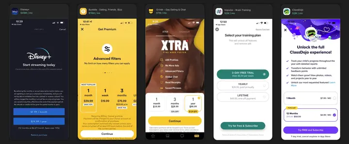
Source: paywallscreens.com
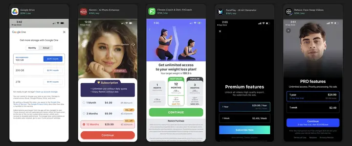
Source: paywallscreens.com
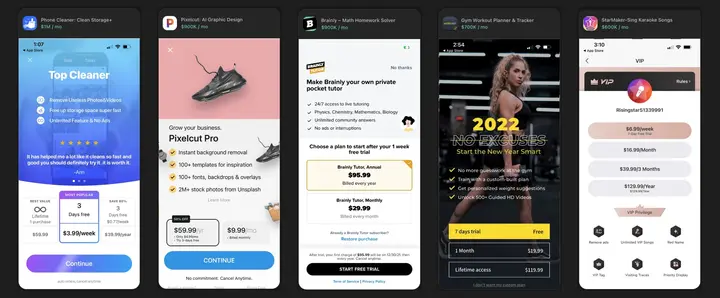
Source: paywallscreens.com
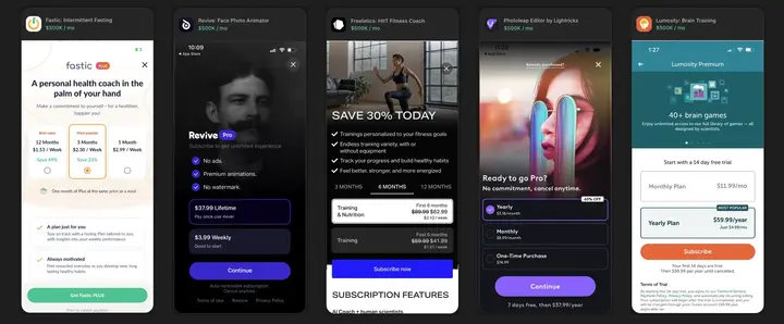
Source: paywallscreens.com
Common Design Choices
Everything I recognized which at least 50% (of a kind) have in common:
100% offer either a Monthly or a Weekly “short-term” plan.
100% offer either a Yearly or Lifetime “long-term” plan.
100% use plain white or black text for the plans or unlocked features list.
95% cover the entire screen without any unrelated navigational elements.
95% fit all important information into one screen without the need to scroll.
90% use a background color to highlight their main call-to-action button.
85% have the pricing plans listed on the bottom half of the screen.
80% use a rounded border outline to highlight the currently selected option.
80% have either a back arrow or an “X” button at the top to leave.
61% of the “X” buttons are put on the left corner (harder to reach for most).
80% have a clearly highlighted call-to-action button at the very bottom.
75% of the call-to-action buttons are capsule-shaped (ends 100% rounded).
56% of the call-to-action buttons use the exact same title: “Continue”
70% use a vertical list of buttons for the different plan options.
70% of those with a preselection opt for the long-term recurring option.
60% use a white background behind the list of plans to select from.
55% mention the name of the app somewhere in the top half.
65% offer either a list, grid, or page view with 2-6 (avg. 4) features unlocked.
77% of those offering a list use a checkmark icon in front of each feature.
55% use a background image stretching all to the top edge of the screen.
50% offer a free trial for at least one paid plan.
50% mention a discount percentage compared to other options.
Less Common Design Choices
Things that I noticed some paywalls do, but the majority of them do not:
45% use a different background color for the currently selected plan.
35% have a “Popular” / “Recommended” tag on one of the purchase options.
30% have a radio button like a dot or checkbox to highlight the selection.
30% use a horizontal list of buttons for the different plan options.
30% provide a (less highlighted) “Restore” button within the paywall.
30% provide a (less highlighted) link to their terms and privacy policy.
15% use a page view to show off the features unlocked by the purchase.
10% provide a segmented control to switch between Monthly/Yearly etc.
5% have an animation on their call-to-action button (or anywhere else).
The Paywall Blueprint
With the learnings from above, I built a “blueprint” that incorporates them all:
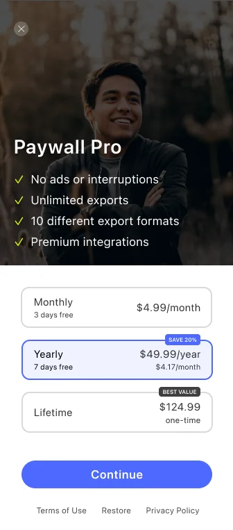
I’m not a professional designer, but I think it’s good enough for the first public release of FreemiumKit. Better designers than me in the community are invited to contribute (fancy) improvements or entirely different designs. The README has a dedicated section describing how to build your own designs. From what this screen looks like overall and looking at the 20 paywall designs I checked, I think it’s wise for the framework to focus on the part that involves more logic. The entire top half of the screen is very simple to do in SwiftUI (just an Image with an .overlay, a Button and a List of Text views). And the same is true for the less highlighted “Terms of Use”, “Restore”, and “Privacy Policy” buttons at the very bottom.
This is the only part in the paywall blueprint with complex logic.
So let’s focus on the part that loads and lists the available products, highlights the current selection, shows potentially available trial periods, long-term plan discounts, the price tag, a second monthly price tag for better comparison, a “Best Value” or “Most Popular” badge, handles the current plan selection & the logic to show & disable the “Continue” button when needed. As you can see, this part is quite complex to get right, and because (nearly) all that information is actually provided to the app by StoreKit, it’s a great opportunity to simplify things. By leaving the rest of the screen to the developer/designer with all the learnings and the blueprint shared above, users of the library should have full freedom & flexibility to create a unique look for their app’s paywall.
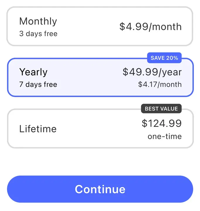
To make things more fun and to make A/B testing possible even in the initial release of FreemiumKit, let’s also create a horizontal list variant like this:
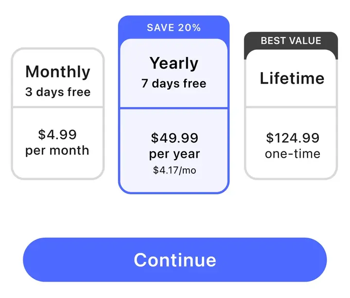
Putting them both side-by-side in their full-screen extent, they compare like this:
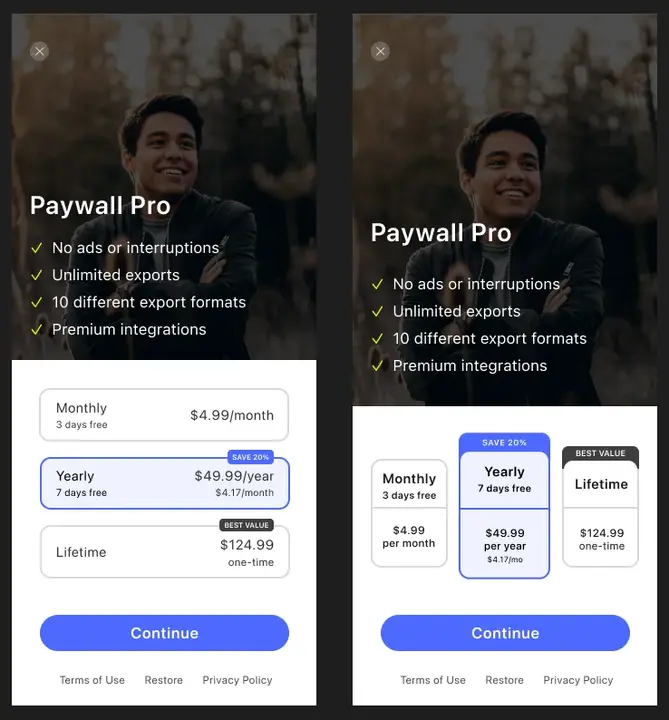
The vertical (left) and horizontal (right) paywall blueprints, side-by-side.
Vertical & Horizontal Products Style
FreemiumKit ships with a SwiftUI view named AsyncProducts, which works quite like AsyncImage: You provide it with the product identifiers you want to show in your paywall (like you provide AsyncImage with a URL of your image), and AsyncProducts takes care of fetching the products from the App Store (like AsyncImage fetches the images from the web), shows a placeholder while loading the data, and even presents an error message with a reload button if there are network issues. In other words: It does all the hard work, you just need to decide where on your paywall you want to place it and what size works best for you:
AsyncProducts(
   style: PlainProductsStyle(),
   productIDs: ProductID.allCases,
   inAppPurchase: AppDelegate.inAppPurchase
)
Sample usage of AsyncProducts.
The productIDs & inAppPurchase parameters are explained in the step-by-step Getting Started guide within the README. What we care about in this article is the style parameter that allows you to pass in different designs for the UI component. The PlainProductsStyle is just a demo style that shows the minimal implementation of a style for those who want to create their own styles. It’s not intended for direct use. The two real styles FreemiumKit ships with in 1.0 are:
VerticalPickerProductsStylefor the left design from aboveHorizontalPickerProductsStylefor the right design from above (WIP)
Also, I plan on adding at least one more style named something like HorizontalButtonsProductStyle which implements a UI without a “Continue” button like used in the paywall of Apple’s newest app Final Cut Pro for iPad:

Paywall in Apple’s new Final Cut Pro app for iPad.
But let’s focus on the styles available today and use the vertical picker instead:
AsyncProducts(
   style: VerticalPickerProductsStyle(
      preselectedProductID: ProductID.proYearly,
      tintColor: .blue
   ),
   ...
)
It takes two arguments, one which lets you specify the product which you want to highlight as a pre-selection. Learning #15 from the above analysis tells us that 70% preselect the long-term recurring option. The other argument lets you choose the tint color, which is used for both the “Continue” button background and to highlight the user’s current selection. Just make sure to select a color that contrasts nicely with white because that’s the continue button text color.
If you want to test out different paywall designs, it’s very easy to switch out the style for A/B testing: Just replace VerticalPickerProductsStyle with HorizontalPickerProductsStyle and all should just work. These two styles even take the same arguments, so it’s really easy. Other styles like the planned HorizontalButtonsProductsStyle will have other arguments, cause there’s no notion of “selection” for a direct button-only style like that, but it should still be easy enough to change that up. All styles conform to the AsyncProductsStyle protocol, so if you want to create a variable to which you can assign different styles based on your A/B test group, you can use any AsyncProductsStyle as its type.
Conclusion
And these are my learnings from analyzing 20 successful paywalls. I put all my learnings into the VerticalPickerProductsStyle which ships in FreemiumKit, so you can easily use AsyncProducts view in SwiftUI instead of dealing with complex logic. You just need to remember to apply the less complex learnings like placing AsyncProducts in the bottom half of your screen, providing both a short-term and long-term subscription, or providing a list of features to unlock in the top half.